
Hi, I'm Stephanie Zarate A
Graphic Designer living in Illinois.

Game Realm Magazine

Space Station


Climate Musk Ox


Montana State Seal & License Plate


McKinley App Redesign

SCD Internship


Meet in Howl's Moving Castle


Enviromental Conservation App

![Grad Gourmet Cookbook]()
Grad Gourmet Cookbook


Grad Gourmet Cookbook
DATE/DURATION:
February 2025 - May 2025
TOOLS:
Adobe InDesign, Adobe Illustrator, Adobe Photoshop
SUMMARY:
This is my capstone project, where I decided to design a Cookbook
based on the dishes I made throughout college. This cookbook is a collection of the meals that got me through college, recipes that mean something to me, reflect my roots, and bring people together.
PRILIMINARY RESEARCH
Before designing, I did some online research. For my research, I read 4 different articles on how people use cooking to stay connected to their heritage and explore different cultures of food. This is my summarization of my online research.
After conducting my online research, I created a survey
with a series of questions regarding food, culture, and their intersections. To my surprise, I got a ton of responses, and
they are shown below!
DESIGN BRIEF
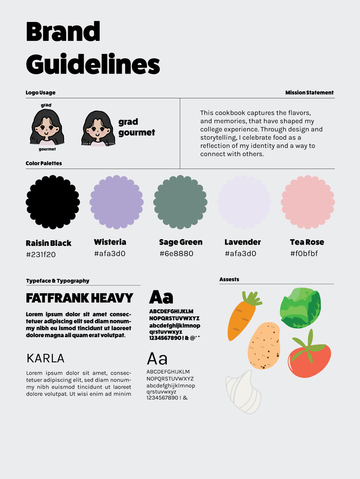
Once I knew what direction I wanted to go with, I
designed my brand guidelines. I highlighted the mission statement, color palette, typography, and assets
I would use for my cover design.
MOOD BOARD
When I began my preliminary research into what kind
of cookbook I wanted to do, I saw a ton of different
styles and themes. I first created a moodboard based on the feeling I wanted to invoke while people read through my stories behind every dish. I wanted it to feel like they could enjoy these dishes with their friends, family, or the person they love, just as I did. For my moodboard on inspiration for the kind of cookbook I wanted to design, illustrative designs caught my eye, as well as bold and pastel colors.
SKETCHES
When I began sketching, I knew I wanted something that was illustrative and vectorized. When I began designing my posters to accompany my exhibition space, I drew inspiration from vintage promotion posters, and playful advertisements that include a lot of eye-catching words.
FINAL DESIGN FLIP BOOK
FINAL DESIGN BANNER & POSTER


Space Station
DATE/DURATION:
February 2024 - February 2024
TOOLS:
Adobe Indesign, Adobe Illustrator, Adobe Photoshop
SUMMARY:
I was tasked with designing a poster and Instagram
carousel for Space Station Dance Studio.
DESIGN BRIEF
Space Station is a dance studio based in St. Louis, Missouri. They held their yearly dance event that included many different dancers. With the space station branding in mind, I had to create a poster
and a social media Instagram carousel.
FINAL POSTER

With the images, type, and branding guidelines given, I created this final poster for the 2024 show. I included two pictures of one of the main dancers and proceeded to play with different textures and effects in Adobe Indesign. Once I liked the results I put it into Adobe Illustrator and began finalizing how I wanted to place everything.My favorite aspect of the poster is the wrap-around text I used for the 'where to buy tickets' section which highlights the Space Station website. I enjoyed getting to use different shapes and colors for the overall design.
FINAL INSTAGRAM CAROUSEL


For the Instagram carousel, I aimed for clarity and simplicity, emphasizing key details like the date, location, and
ticket purchasing options.


Climate Musk Ox
DATE/DURATION:
February 2023 - March 2023
TOOLS:
Adobe Illustrator, Figma, Adobe Photoshop
SUMMARY:
I was tasked with creating anything of my choosing, that encourages action to fight Climate Change. I chose to make a fictional organization's website and merchandise.
DESIGN PROPOSAL
I am starting a climate change brand (fictional) that encourages people to volunteer and work together. We believe that "Acting together makes change." By working as a team, we can tackle the climate crisis. When people get involved, they can overcome feelings of hopelessness and despair about climate change.I am focusing on young people, especially college students at the University of Illinois Urbana-Champaign (UIUC). This brand aims to inspire students to take action together, not just on their own.
When starting my sketches, I wanted to create a strong ox character that symbolized strength. However, when I was making them I felt like they weren't on brand with what I wanted to convey which was to encourage people to help fight climate change. I then changed my direction to make a more friendly, welcoming logo.
SKETCHES

LOGO


FINAL WEBSITE PROTOTYPE
For the Climate Musk Ox website, I created a home page, an about page,
and a buy page where people can purchase the Climate Musk Ox merchandise.


SCD Internship
DATE/DURATION:
June 2024 - June 2025
TOOLS:
Adobe Illustrator, Adobe Photoshop, Procreate
SUMMARY:
While being a Graphic Design Intern for SCD (Siebel Center for Design) I have created and collaborated with a group of designers. I have created posters, and stickers while adhering to SCD's branding guidelines.
FINAL DESIGN'S


Game Realm Magazine
DATE/DURATION:
Febuary 2024 - May 2024
TOOLS:
Adobe Indesign, Adobe Illustrator
SUMMARY:
I was tasked with designing a magazine of my
choosing; the topic I chose was gaming!
DESIGN BRIEF
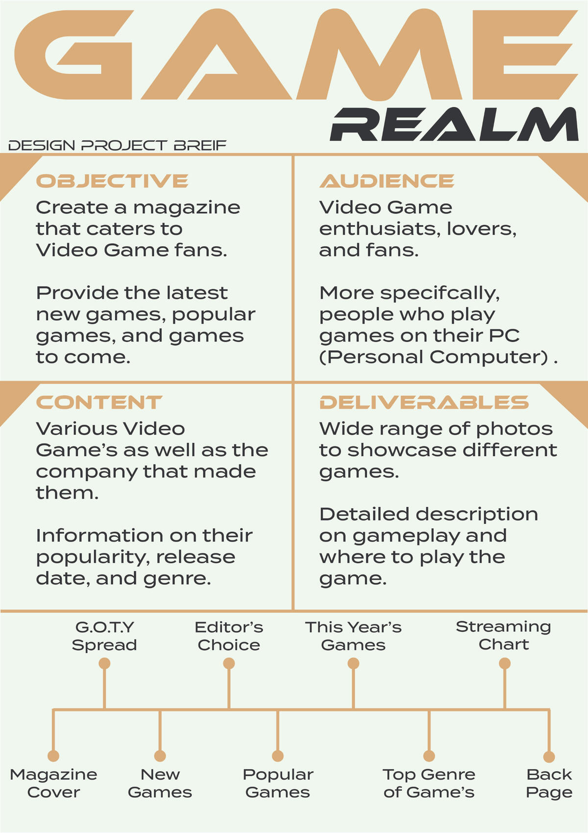
Once I knew what direction I wanted to go with, I
designed my project brief. I highlight the objective
of my magazine, the target audience, and the type
of content and pages I would include.
MOOD BOARD
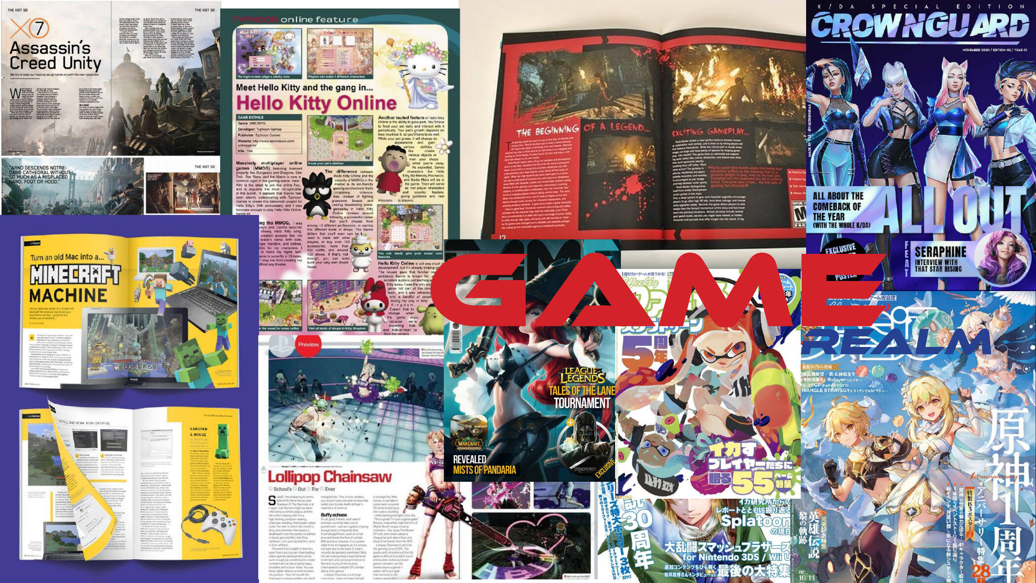
When I began my preliminary research into what kind
of the magazine I wanted to do, I saw a ton of different
styles and themes. The ones that caught my eye
the most I put in my mood board, I wanted something
eye-catching with a rounded geometric font.
SKETCHES


When it came to my sketches, I practiced a lot of different layouts and looked at different
gaming magazines that was already established to understand what layout themes I saw.
FINAL DESIGN FLIP BOOK


Montana State Seal
DATE/DURATION:
October 2023 - November 2023
TOOLS:
Adobe Illustrator, Adobe Photoshop
SUMMARY:
By randomization, I was given the state of Montana.
I was prompted to create a state seal and license plate
aligning with the state in some way.
FINAL DESIGN'S
I sought to ensure a cohesive color palette for the license plate, incorporating the blues and yellows derived from the seal. My objective was to create a vintage and colorful aesthetic. Consequently, I included illustrative elements, such as the state flower, to enhance the overall design. In developing both the state seal and the license plate, I meticulously considered various elements representative of Montana, including the state flower and the state animal. The flag of Montana bears the state motto, “Oro y plata,” which translates to "gold and silver." This phrase provided the foundation for the design of the state seal, which features outlined gold and iron blocks accompanied by a shovel and pickaxe.For the license plate, I wanted to ensure a cohesive color palette, incorporating the blues and yellows derived from the seal. My objective was to create a vintage and colorful aesthetic. Consequently, I included illustrative elements, such as the state flower, to enhance the overall design.

Meet in Howl's
Moving Castle
DATE/DURATION:
February 2023 - March 2023
TOOLS:
Adobe Illustrator, Adobe Photoshop, Figma
SUMMARY:
This is a fictional art exhibition I made for a movie called
Howl's Moving Castle by Hayao Miyazaki.
BRANDING GUIDLINES
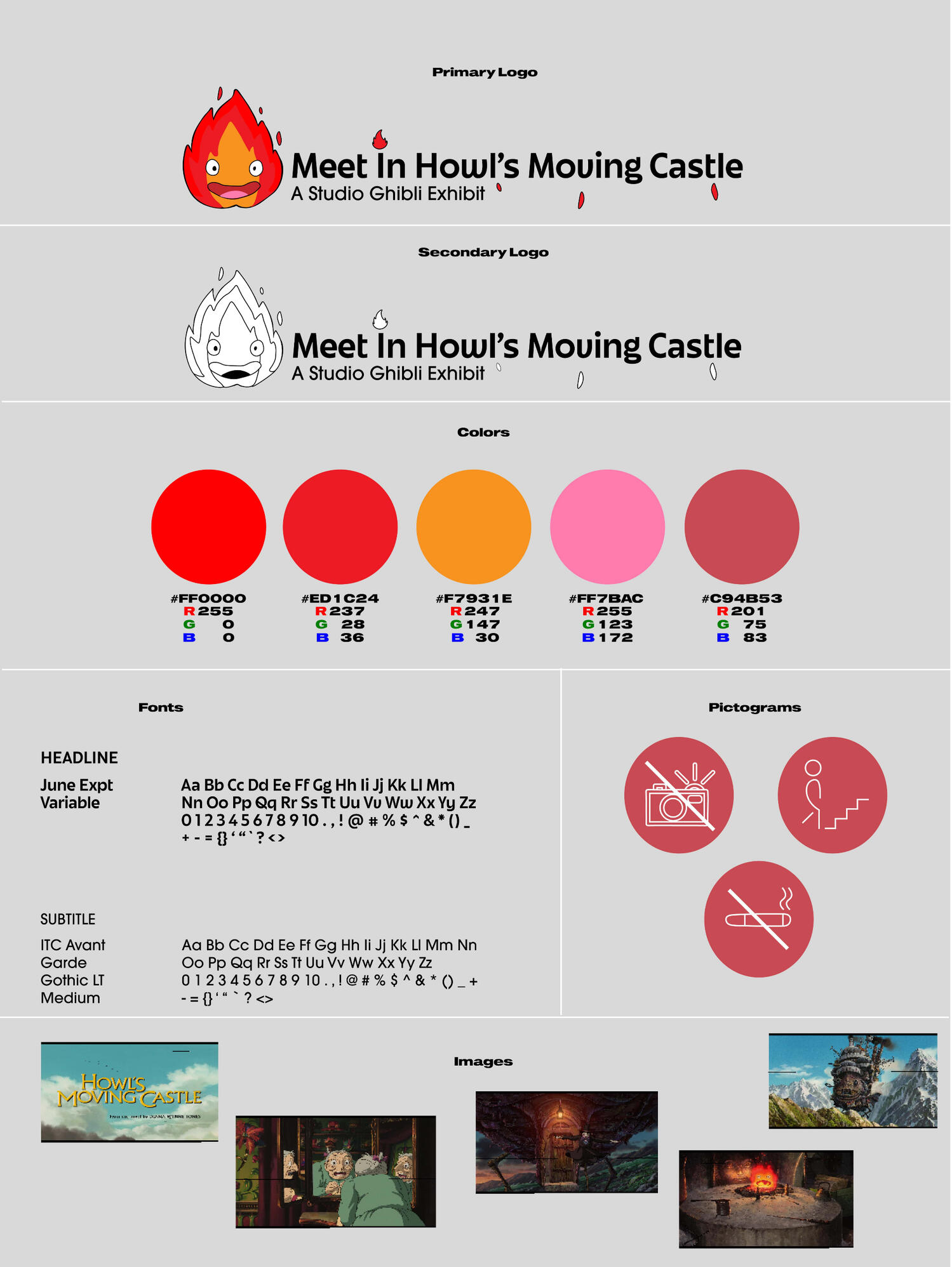
Once I knew what direction I wanted to go with, I
designed my branding guidelines. I highlighted all of the necessary elements such as the logo I made, the kind of
signage that would be seen around the exhibition, and
the overall typeface and color palette I went with.
MOOD BOARD
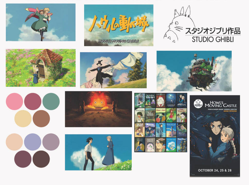
When I began my preliminary research into what kind
of exhibition I wanted to do, I wondered what kind of exhibition my favorite movie could have. Thus I made my mood board centered around Howl's Moving Castle. I gathered screencaps and made two color palettes to see which one stood out.
FINAL POSTER
MERCHANDISE FINAL
Making the merchandise was probably the hardest thing for me to ideate. I researched pre-existing merchandise that the movie has and it included a lot of clothes, pins, stickers, etc.After extensive research and seeing what is trending, I decided on three merchandise pieces: a pin, a hoodie, and a tote bag. I thought of illustrating and making the main character from the logo (Calcifer) into a pin after seeing a lot of inspiration. I also decided to incorporate one of the main protagonists of the movie, Howl, and illustrate a significant scene that everyone who has watched the movie enjoys. Lastly, I illustrated one of the comic reliefs of the movie ‘Scarecrow Man’. I ultimately put him on the tote bag as I feel he fit right in!This part of the project was one of the hardest for me because I spent many hours illustrating and coming up with what specific images or scenes I wanted to illustrate. However, in the end, I am very pleased with how it came out. It really showcases the type of illustrations I am capable of making.
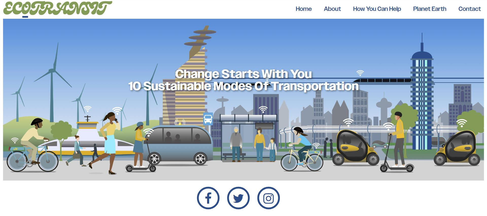
WEBSITE FINAL PROTOTYPE
While creating my website prototype I had no prior knowledge of how to create a website, or use Figma. However, this was a great opportunity for me to dive into website design!As I was designing I kept in mind many things that go into a website, such as functionality, legibility, and overall design. It was a lot of trial and error for me as I was so new to Figma, but after practicing and experimenting with elements, I figured out an easy flow to follow. I made my landing page with gradients that I used previously with my poster. I included information that would be expected to know about the exhibit and added an image carousel at the bottom of the page.When someone clicks on ‘purchase tickets here’ they are met with a page that provides the admission fees for adults and children. As well as a calendar on the side with the dates the exhibit is open and when it is closed.Although this website prototype is very simplistic, it is still understood where someone navigates if they want to purchase tickets. Out of all of the elements I had to make for this exhibition, I think my favorite thing to make was the website. This project sparked my interest in UI design.
EcoTransit Website
Class: ARTD 218
This is my first introduction to coding. I was tasked with creating a
climate change website and this is what my product was.WEBSITE LINK


When I was given this project, I had taught basic knowledge of HTML, CSS, and Javascript. Going into the assignment I was very nervous to create a website from scratch.I had a general idea of how I wanted to layout the pages, However, I know that designing a website versus making it come to life by coding it is really different.I encountered a lot of blocks in the road when beginning to make the landing page and about page, it was a lot of trial and error to make sure the sizing was right, the padding was correct, and everything was aligned correctly.Overall, I am pleased with how these two pages turned out, and I learned a lot about coding and the way it works making these pages.
Working on the next pages seemed like a breeze, however like the previous pages, I encountered blocks in the road.I wanted to do more intricate things and had big plans, however since my knowledge of coding was very limited at the time, I had to think on a much smaller scale.However, I believe that with my limited knowledge, I was able to create a website that I was content with. It felt good knowing I was designing elements for my very own website!


Take Aways:
One takeaway I took from this project was being able to create a website from scratch! I never thought I would be able to learn how to set up or even manage to code a website, therefore being able to get the chance too was great.I learned a lot about the different coding elements and what different commands do. It was a lot of trial and error when it came to having to adjust elements on a page. But overall, in the end, I learned an immense amount about laying out a webpage and how you can create anything you dream of!
mount!


McKinley
App Redesign
DATE/DURATION:
February 2023 - March 2023
TOOLS:
Adobe Illustrator, Adobe Photoshop, Figma
SUMMARY:
I strived to create an app that allows students to make
appointments for the University of Illinois Health Center.
PRELIMINARY RESEARCH

The McKinley Health Center at the University of Illinois is the #1 center for students to go to for any health concern. While analyzing the website, there were many issues that I found.The main issue is how you make an appointment. McKinley only has one way of scheduling an appointment which is by calling them. However, this can be really nerve-wracking for people. Therefore, I strived to create an app that allows students to make appointments at ease without the need to call them.
PERSONA RESEARCH
While thinking about what kind of path I wanted to go down for the app, I thought about the Women's Health section and how It could be further helped.I decided to make my path from opening the app to making an appointment. Specifically tying into women's health.I created 2 different personas that helped aid me in knowing which route to go down when it came to the elements needed in the app.With these personas made I could move forward in creating the prototypes of the app.I figured out the type of flow I wanted to create from the home screen to the end goal which is creating an appointment.I struggled a bit with finding the right wording as well as the type of theme I was trying to go for in the end, I believe I created an ending product I am very satisfied with!

FINAL PROTOTYPE
Thus my final app prototype was made! I worked very hard to make everything very on-brand for the University of Illinois.I incorporated the school's colors as well as the main typeface they use. I designed all of the iconography that is shown and animated the different elements on the Figma prototype. I worked my hardest in making this app as if it was something that was going to be published as an official app, and it is safe to say that I really enjoyed creating this!The home screen introduces all of the categories McKinley offers, including Care categories that I got from the McKinley website/thought of, a common symptoms page that lists symptoms as well and you can choose the type of appointment you want, Main categories for women's health needs. As well as McKinley's health mission statement, a quick information page, a scheduler with a calendar, and available times for each day of the month, and a confirmation page confirming your appointment!

Enviromental Conservation App
DATE/DURATION:
September 2024 - October 2024
TOOLS:
Adobe Illustrator, Adobe Photoshop,
SUMMARY:
Swift is an app that promotes sustainability and reduces carbon emissions. The app would be a bus system at UIUC and the surrounding Champaign-Urbana area, promoting green transportation and including unique features to encourage specifically students to use the app every time they travel via the bus system.
RESEARCH PROCESS: SURVEY
Once deciding on a topic, I used the survey research method to conduct a questionnaire about what transportation people use, and what they would want out of a bus app.Overall, I got 9 responses and it seems that people mostly use the bus to get around campus, use it daily and many don't mind getting insight on how their trip is helping the environment.

What is your current student status?

Do you use any kind of transportation?

What kind of transportation do you use to get to class?

How often do you use the campus bus service?

How would you rate your experience with the bus service?

Would you use an app that tracks the bus and the information on the green impact of your bus rides?

Would receiving information about your environmental impact encourage you to use the campus bus service more frequently?


USER PERSONA

Since I had the direction and research I needed, I made my user persona based on someone who uses the bus app frequently
and uses multiple different bus lines. My persona hopes to have a bus app that helps tackle her frustrations, while also targeting some of her needs.
PROJECT OVERVIEW:
An app that promotes sustainability and reduces carbon emissions. The app will be a transportation app for the bus system at UIUC and the surrounding Champaign-Urbana area, promoting green transportation and including unique features to encourage specifically students to use the app every the time they travel via the bus system.
RESEARCH QUESTION:
How can a sustainability-focused bus app influence transportation habits and promote eco-friendly behaviors among college students?
PROJECT SCOPE:
The app is for the Urbana-Champaign area and can help promote sustainability and reduce carbon emissions. The target audience is the students, faculty, and anyone in Campustown who uses transportation apps and uses the bus at any given time. As well as for people who want to promote green habits and sustainability.
DESIGN GOALS AND OBJECTIVES:
Having real-time tracking of the different buses.
Having a garden-like space where you can customize.
Track your different trips and how much carbon emission was reduced from them.
Easy navigation and interface.
PROBLEM STATEMENT
Many students still use personal transportation, even though the campus bus service runs 24 hours a day. This choice adds to traffic congestion and increases carbon emissions. Public transportation is a sustainable option, but students often lack the motivation and information to use the bus system effectively. Many are also unaware of how their transportation choices affect the environment. My research and app aim to improve the campus bus experience, promote sustainability, and encourage students to choose
eco-friendly transportation, all while making the app more enjoyable to use.
SKETCHES


LOW-FIDELITY PROTOTYPE


MID-FIDELITY PROTOTYPE


HIGH-FIDELITY PROTOTYPE


FINAL DESIGN


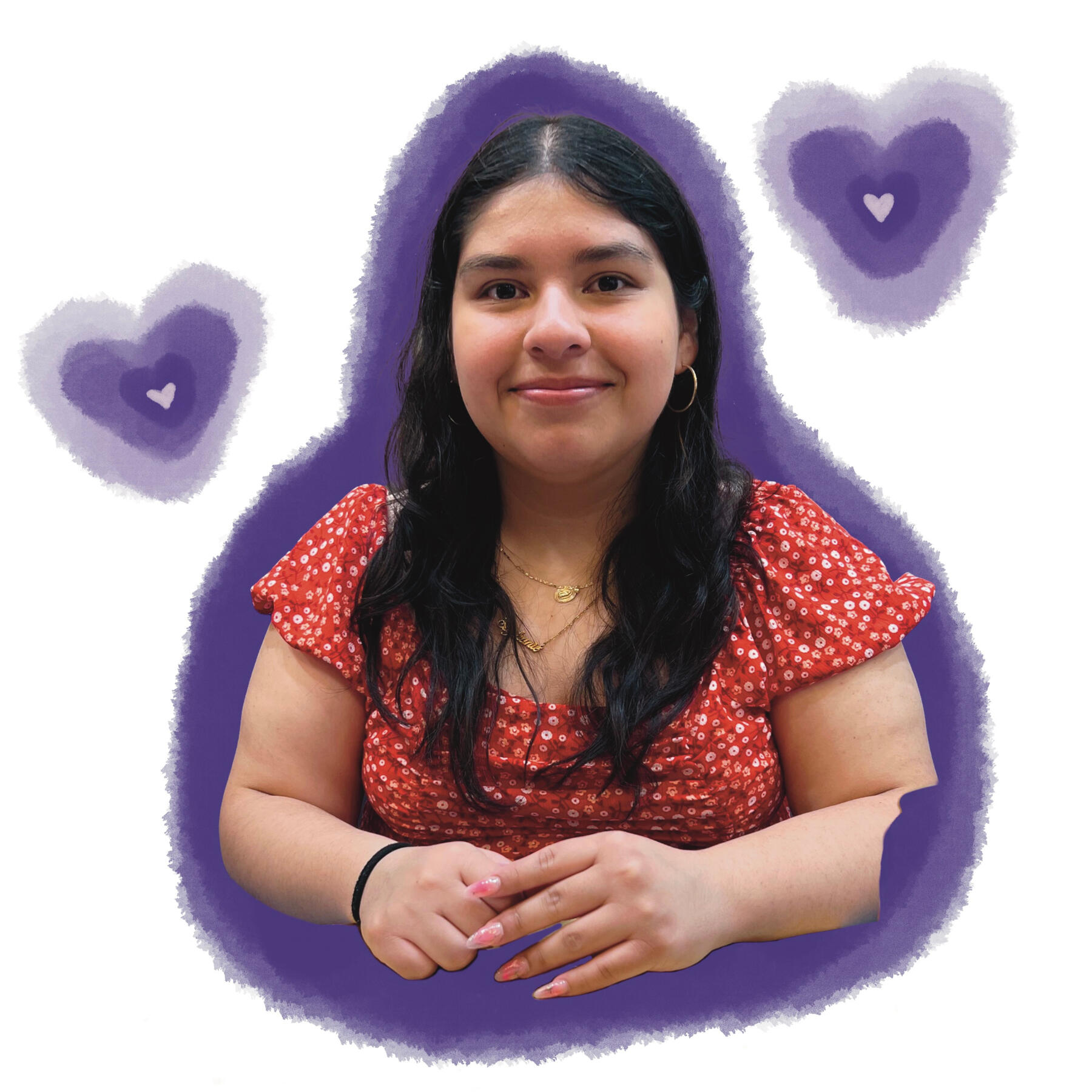
Hi! I'm Stephanie
I'm a 22-year-old graphic designer from the Greater Chicagoland Area and a graduate in Graphic Design from the University of Illinois at Urbana-Champaign.My design principles are rooted in my passion for creating designs that resonate and inspire. My work is grounded in a deep commitment to innovate and collaborate with an open mind. I believe in the power of design as a tool for impactful storytelling and take pride in delivering work that not only engages but also leaves a lasting impression. As I step into the professional world, I look forward to bringing my creativity, commitment, and fresh perspective to a team that values the art of meaningful design.
